

A real estate developer sells something the buyer often can't see or touch: an off-plan apartment, a house that's still a floor plan, a building that today is a crane and a construction sign. And they sell it to someone about to put in a big share of their savings, or weighing it against other investments.
That buyer doesn't decide in one visit. They look, compare, come back, show the project to their partner or their accountant, and only then get in touch. Throughout all that time, the website is the salesperson in front of them. If it doesn't answer what they need to know, they move on to a project that does.
That's why a developer's website isn't like any other company's. The page doing the most work isn't the home page or the "About us": it's the page for each development.
What buyers look for before they reach out
Before sending a message, someone weighing an off-plan purchase wants five things answered:
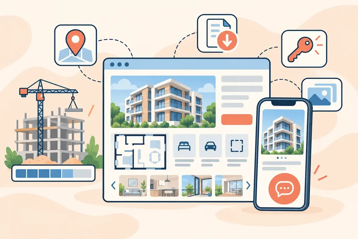
- Where it is, with the exact address and a map, not just the neighbourhood.
- What's inside: how many units, how many rooms, how many square metres, with or without parking.
- What it'll be like: renders, floor plans and the list of finishes. This stands in for the visit they can't make yet.
- What stage it's at: planned, under construction or finished. And if it's under construction, how far along it is.
- Who's building it: what other projects the developer has finished and what past buyers say.
A website with all of that in order does the filtering for you. The inquiries that come in are from people who already know which unit they want, where and when. A website without it generates the most expensive message in the business: "Hi, can you send me some info?".
The development page, section by section
This is how we approached the development page in three projects in the industry. Each one sells differently, but the page plays the same role in all three.
At Nicolino, a developer based in Morón, Buenos Aires, every page opens with the hard facts up front: address, number of towers, number of units, rooms, parking spaces and status. Below that, the list of what every apartment includes, from kitchen cabinets to access control and security cameras. And at the end, two buttons: download the brochure or get in touch.
At Estate Join, which builds homes in neighbourhoods in Pilar and Luján, each unit's page adds the project description, floor plans, an image gallery and a block you rarely see on developers' sites: construction progress as a percentage, with the date it was last updated.
At BlendArq, the page reads as one continuous journey: the project description, the spec sheet, the floor plans for each level, construction progress, the map and the contact form, in a single scroll with no tabs.
Note: Construction progress with a date is one of the things that builds the most trust. What worries an off-plan buyer more than anything is whether the build is moving forward. Showing it, and showing when it was last updated, answers that question before they have to ask.
The brochure belongs inside the website, not instead of it
Plenty of developers have a beautifully designed PDF brochure, and their website just says "ask us for the brochure". It's a costly mistake: the PDF doesn't show up on Google, doesn't update itself, and makes people hand over their details before they even know if the project suits them.
What works is the opposite. The page shows everything, and the brochure is there to download for anyone who wants to keep it, print it or forward it. In all three cases the download button sits on the page next to the contact button, and it's never a condition for seeing the information.
Make sure inquiries arrive with context
An inquiry is worth far more to a developer when it comes with the name of the project and the unit. That's why contact options belong on every development page, not just on a separate contact page:
- A form on the page itself, which already knows which property it's about. At Estate Join and BlendArq the message comes pre-filled with "I'm interested in this property".
- WhatsApp within reach on mobile, for anyone who'd rather message than fill in a form.
- Other projects at the foot of every page, each with its status. Someone who didn't find what they wanted in one development can move on to the next without going back to the list.
The goal isn't more messages, it's that every message arrives further along. The sales team stops explaining the basics and starts the conversation where it really matters: availability, financing and viewings.
Trust is designed too
Buying off-plan comes down to trusting that the developer will deliver. The website can back that trust with concrete proof, rather than lines like "quality and commitment":
| Proof | Where it goes |
|---|---|
| Finished projects, with their status | The developments list, each with its status in plain sight |
| Construction progress with a date | The page for each development under construction |
| Buyer reviews | The home page, with the source visible |
| The real office address and phone numbers | The footer of every page |
At Nicolino, for example, the projects list shows finished, under-construction and planned developments side by side, and the home page brings together buyer reviews taken from Google. Both answer the same question: "do these people finish what they start?".
Before you commission your development company's website
If you're about to rebuild your website, or build your first one, these questions shape the work before anyone talks design:
- How many developments will you show, and at what stages? That defines the listing and its filters.
- What information do you have on each unit, and who will keep it up to date as availability changes or construction moves forward?
- How do inquiries reach you today, and what do people always ask? Every repeated answer is a block on the page.
- What visuals do you have: renders, floor plans, construction photos, photos of finished projects?
With that clear, the website stops being a business card and becomes a sales tool. If you want to see how we approach a project like this, it's all in servicios.